I am very excited to share with everyone here a visualization tool I have been working on for PX4 ULogs.
First things first here is a teaser of the tool in action!
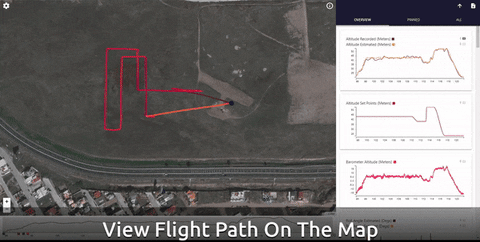
The main idea behind Data Comets is that flight data is recored in space as well as time. So why don’t we show where data happened instead of just when. Data Comets allows you to encode flight data onto the flight path itself as a color map. Encoding jamming or noise could show you areas with bad gps signal, or encoding velocity will show you how the UAV speeds up or slows down to get to all the setpoints.
Data Comets also lets you filter the flight data shown by time using the timeline. This lets you focus on certain times of the flight, but this also lets you animate the flight through interaction.
The tool is also interactive and allows for hover for details on demand, linking charts, and pinning data to compare.
I would like this discussion page to be a place to hear your feedback as well as answer any questions about the tool you may have.
Data Comets was developed as a part of a information visualization design study for UAV flight log analysis. We are currently in the process of writing a journal paper for the study and at this stage we are hoping to evaluate Data Comets and the overall design study.
I am very excited to release this to the community and would like to grow and improve this tool with everyone.
Hope you enjoy and look forward to getting your input!
David
Also want to give a special thank you to Daniel Agar, Anthony Daniel, and Jun Kim for all their help with this study and project.
Feel free to extend if you think more needs to be said at this level (I assume you don’t want a full page on this in the user guide because then you would have to maintain it in multiple places).
The first two features that came to my mind that I would like to have:
Being able to change the size of the map and graphs. Depending on what I want to have a closer look at I would like to have the graphs take up most of my screen and not the map. For other aspects it’s cool to have a big map, so being able to change the window sizes would be really helpful
Being able to mix and match different graphs on the same plot, similar to how the Flightplot tool is handling it.
I do plan on implementing a pop out window for the charts that will show a chart focused view. I have heard this from a few people now and I do think it is a good idea.
The seconds one is a little bit tricky. I played around with the idea of being able to drag charts onto on another to plot them simultaneously, however it is really difficult to plot data points with multiple scales together without potentially creating misleading or hard to read visualizations.
That is one of the reasons for the pinning functionality so you can pin two charts to appear inline with each other and you can compare them that way. What I am hearing is this is a little un-natural to people which is why some of the overview charts are plotted together when they share the same scale.
It is an interesting problem and can definitely be a cool project for the future so I will keep it in mind.
Thank you again!
have windows laptop and android tablet. would like to run in the field on local without requiring internet link.
.
I don’t know about python… is this my solution?
Yes the local version is your solution for running it on a windows machine, there is currently no native android solution if you do not have an internet connection.
To be more comprehensive than the github README
You will need to install python3
and git
then using your terminal in a directory you want the folder
git clone https://github.com/dsaffo/DataComets.git
cd DataComets
pip install -r requirements.txt
python DataCometsLocal.py
It should launch a browser for you automatically and you can then drag or select the .ulg files.
Everything should work offline except for the map tiles so you will just see the flight path on a grey background. I will work to have a way to save offline maps for future versions as it seems like something people will find useful.
@dsaffo Is there an official way to use the “local” version as an intranet server? We are multiple pilots at the office and we have a high performance server on which I would like to run this.
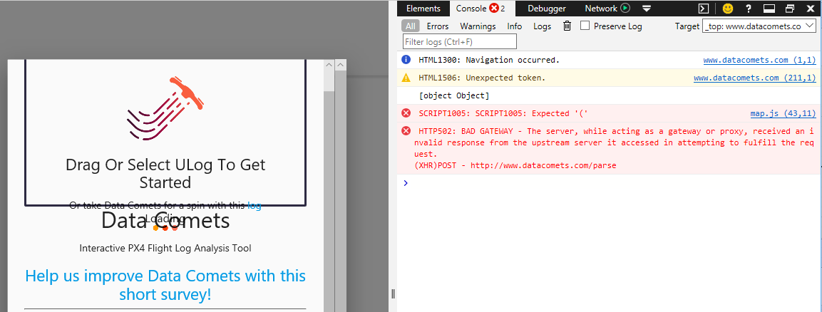
@rollys I apologize error handling is not great right now, if you open up the web console (ctrl + shift + i) you might see an error message. If I had to guess it is most likely related to certain data not being in the log like GPS position. If you don’t mind sharing the log with me I could take a closer look?
Yeah, for some reason, this log doesn’t have the GPS position since it didn’t show the map in px4.io either. Anyway, just remove the .dxf and unzip this file.
Thanks, I should add a fallback to just show the line charts if there is no gps information, that way the tool is still useful for logs without that info.
This is not an error I have seen before, it looks like a network error and pyulog library is failing to parse the file. I can take a closer look if you share it with me but using the local version also might solve the issue.
@dsaffo Thanks. It worked like a charm. However, as other user have stated, I have some issues with older flight logs. Lastest PX4 release logs works perfect though.
Thank you for bringing that to my attention, I was not aware there was a big difference between new and old logs. I will look into a fix for that this week.
@dsaffo This looks awesome! I installed and ran the local version on my Arch Linux machine and it seems to be getting stuck after the first plot. It sits there forever with the status “Plotting” and I can see that it drew the first plot in the background.
I suspect this has to do with older versions of PX4, the logs are a little different and that breaks some stuff. I am working on a fix right now but having examples of these older logs would be very helpful, would you mind sharing it with me?